Anchor Point Village Logo
Project Overview
Anchor Point Village is a nonprofit organization focused on improving child passenger safety through education, resources, and community support. This project involved creating a cohesive visual identity and outreach materials to help the organization connect with families and the community.
Anchor Point Village Logo

Design Approach
The Anchor Point Village logo was designed to reflect the organization’s mission of supporting families and creating a sense of safety and stability. The illustrated village symbolizes connection and community, representing the idea that families do not have to face challenges alone. Warm sunset tones and approachable typography create a friendly, welcoming identity that reflects the heart of the organization’s work.
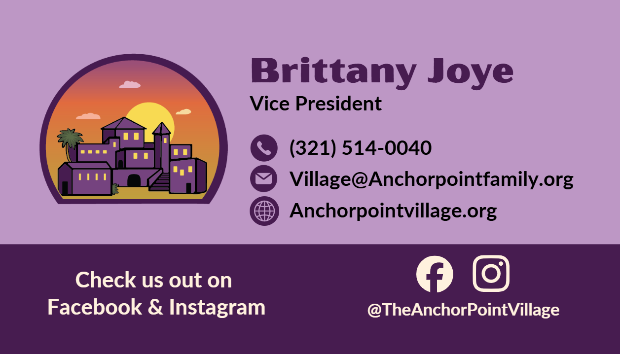
Business Cards
Once the logo was finalized, the next step was developing brand materials that could be used for everyday communication. Business cards were designed to provide a clear and professional way for the organization to connect with families and community partners.
Outreach & Informational Materials
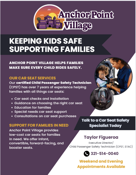
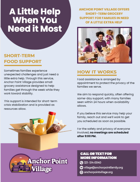
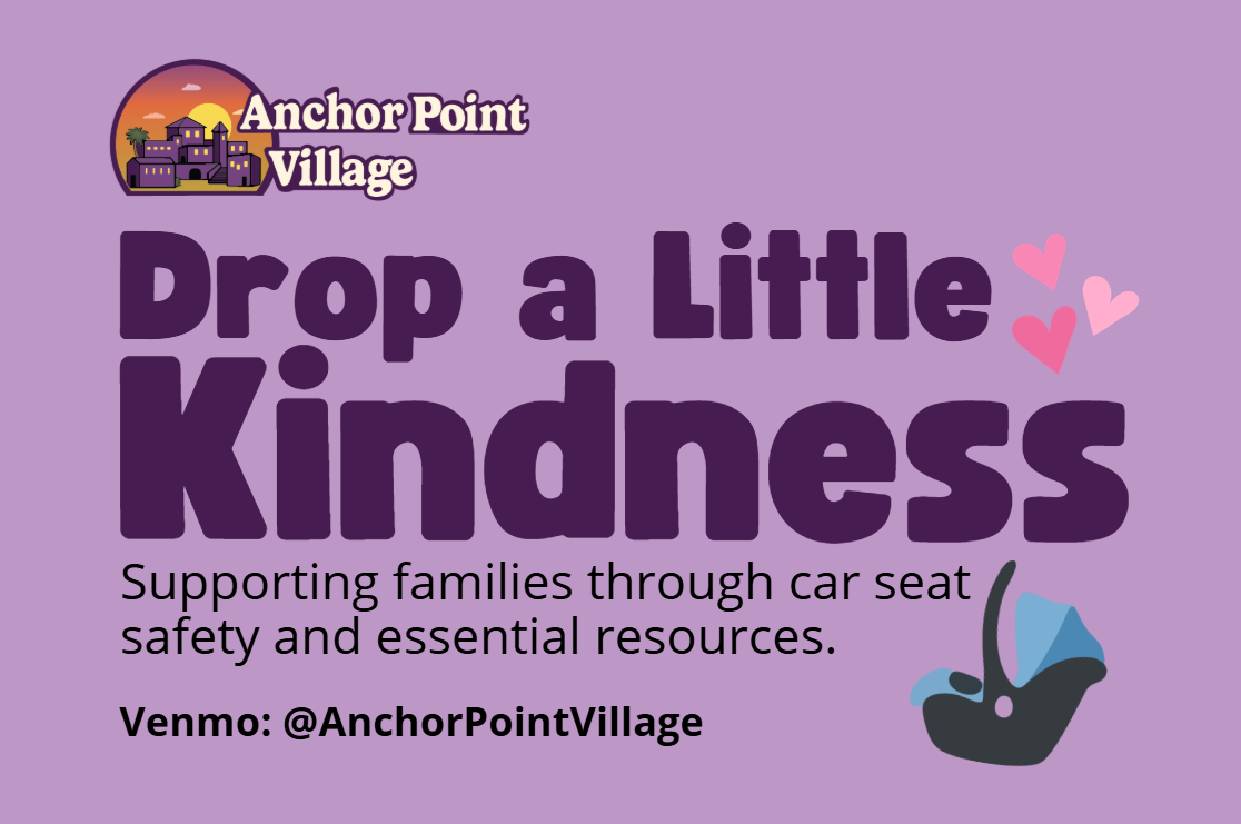
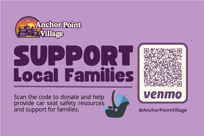
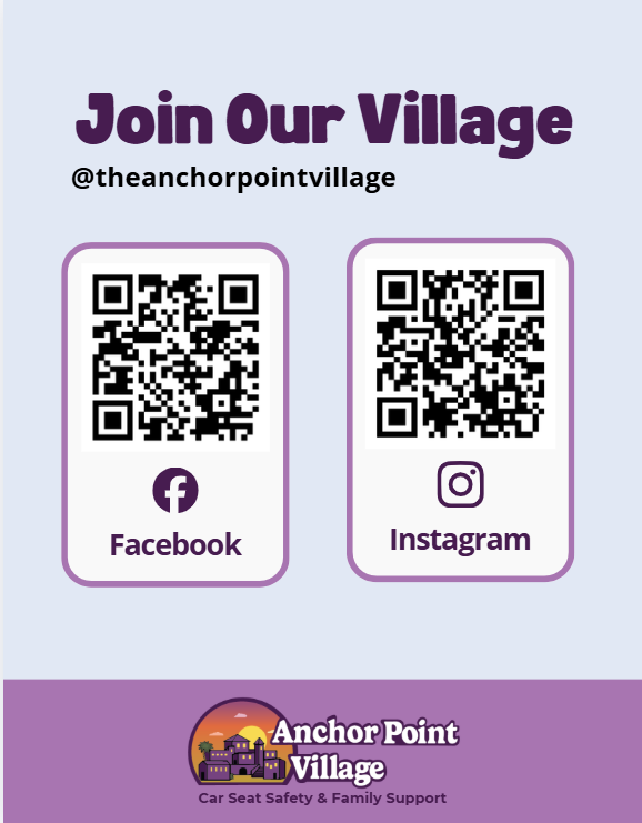
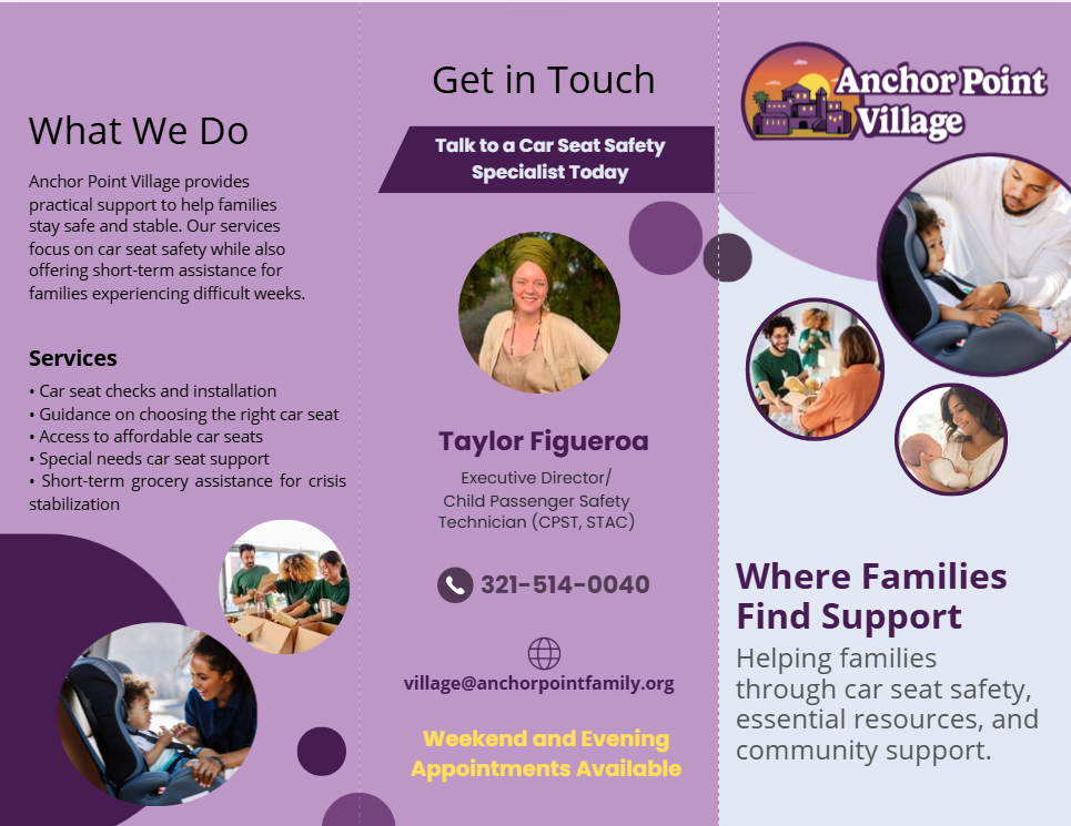
These outreach flyers were designed to help Anchor Point Village communicate its services in a clear, welcoming way. Each piece highlights a different part of the organization’s mission, including car seat safety education, short-term grocery support, and ways the community can help local families. Simple layouts, clear headings, and friendly visuals make the information easy to understand while reinforcing a sense of trust and support.
Advertising Materials
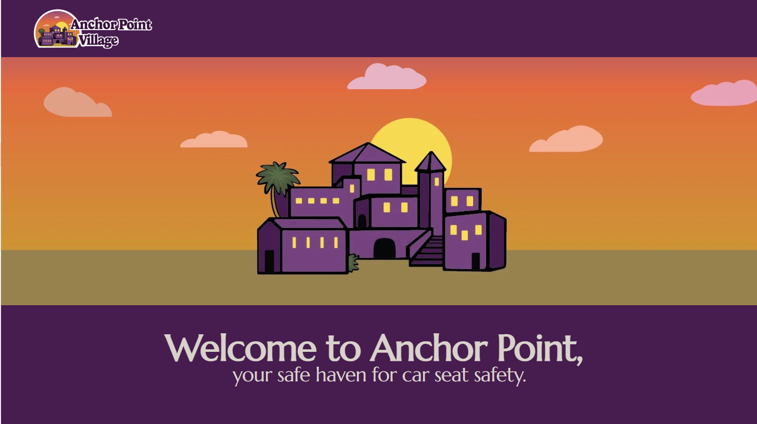
Anchor Point Village Website
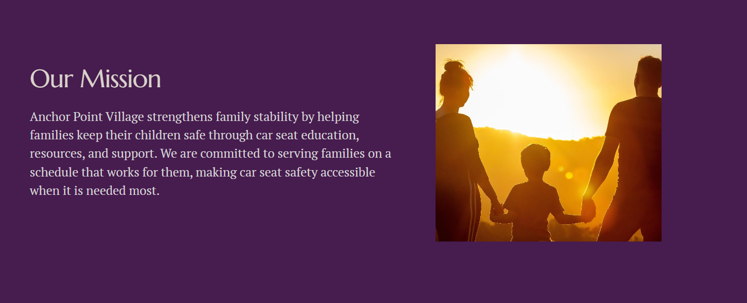
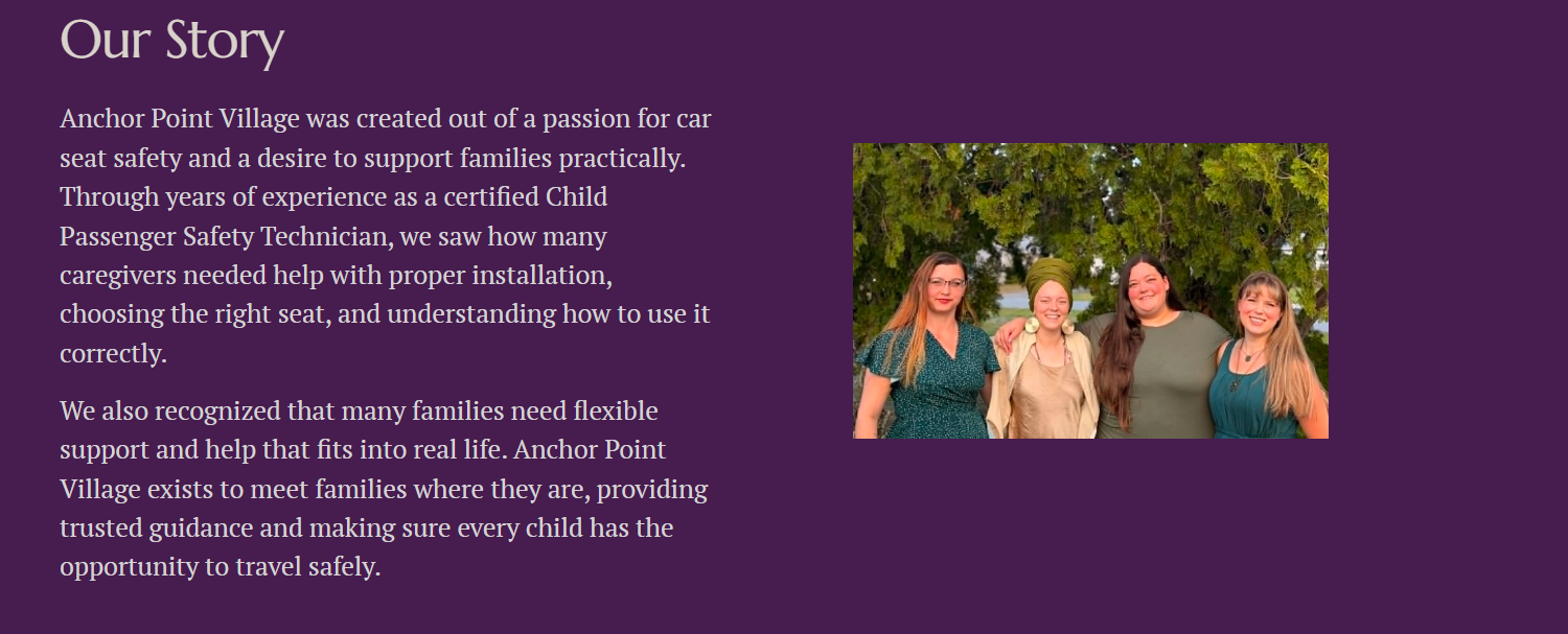
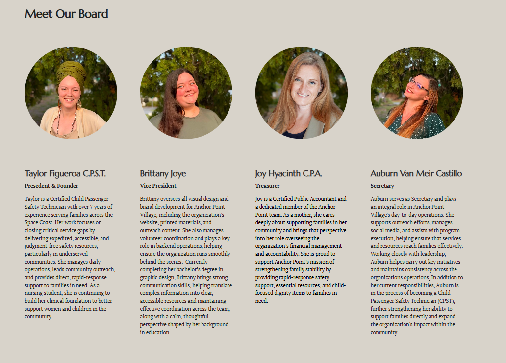
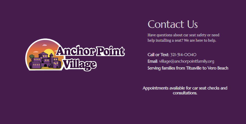
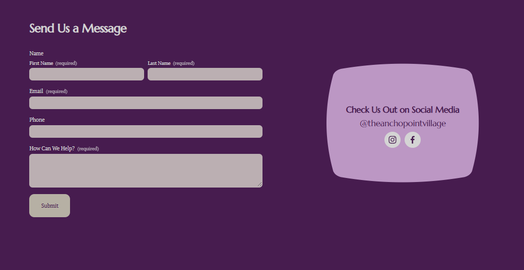
The Anchor Point Village website was designed to give families a clear and welcoming place to learn about available services. The layout focuses on simplicity and easy navigation so visitors can quickly find important information such as the mission, resources, and contact details. Consistent colors, typography, and imagery carry the brand across digital platforms while reinforcing a safe and supportive space for families seeking guidance.