Project Overview
Seabreeze Shores is a branding campaign designed to promote a picturesque coastal town inspired by the Florida communities near where I currently live. The goal of the project was to create a visual identity that felt peaceful, welcoming, and connected to the relaxed atmosphere of seaside living.
The campaign combined branding, print design, original photography, and image compositing to create a cohesive promotional experience. Soft coastal colors, scenic imagery, and clean layouts were used throughout the project to communicate warmth, tranquility, and community.
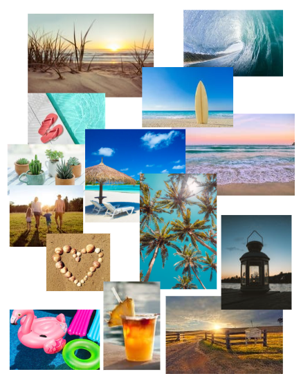
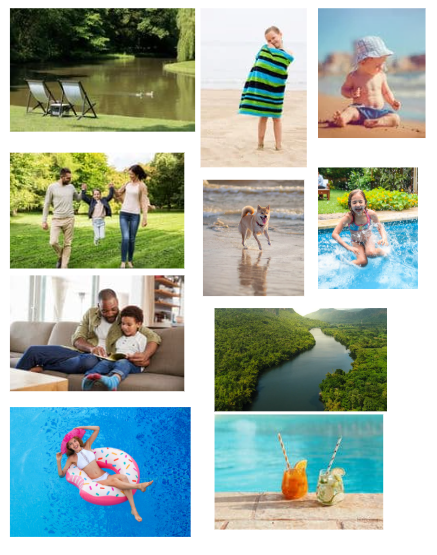
The visual direction for Seabreeze Shores was inspired by the natural beauty of the Florida coastline. I drew color inspiration from a sunrise photograph I personally captured along the beach, using soft blues, warm neutrals, and ocean-inspired tones to establish the overall mood of the brand.
The project focused on creating visuals that felt authentic and inviting while reflecting the calm pace of coastal living through photography, typography, and composition.
Idea Sketches
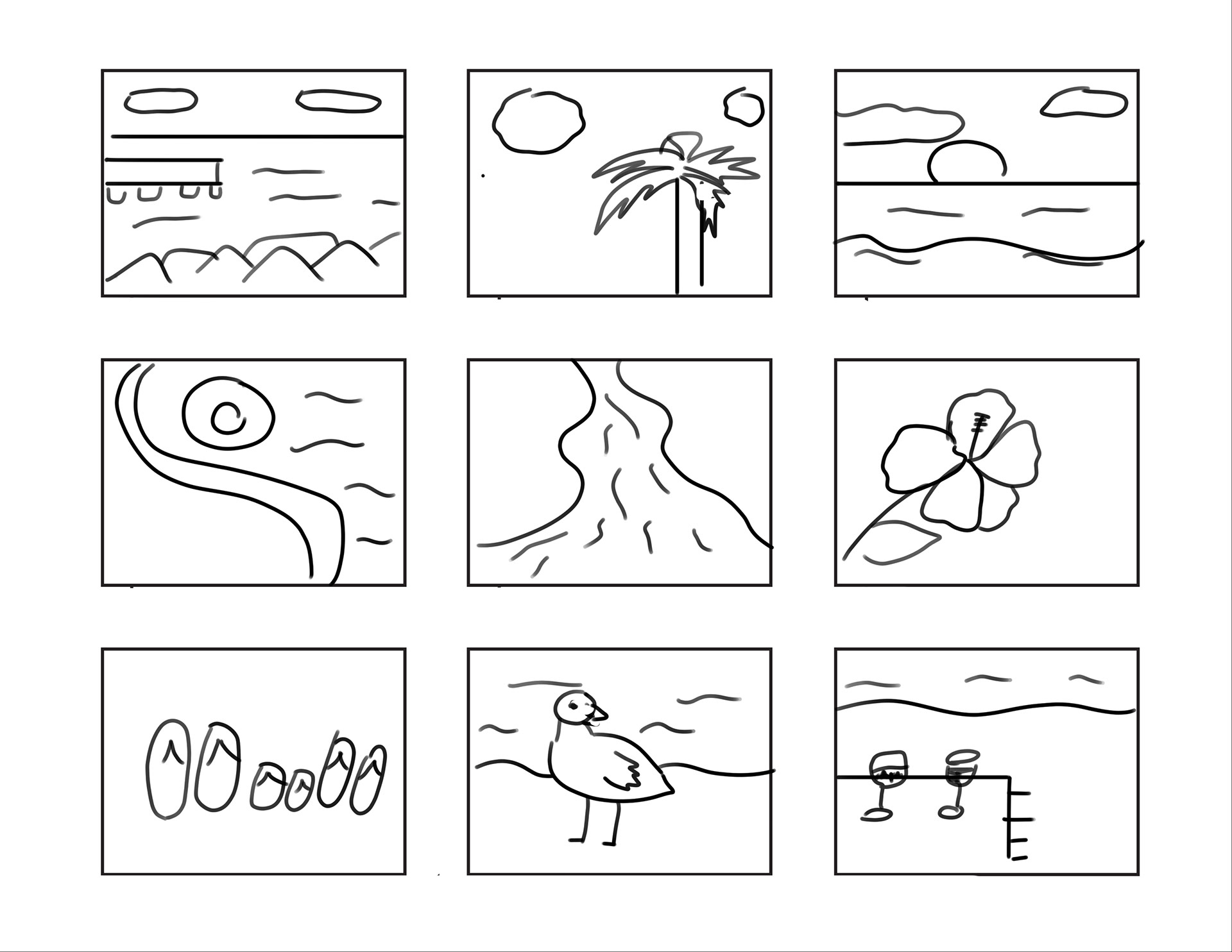
Thumbnail sketches and early concept drawings were used throughout the project to explore composition, branding directions, photography concepts, and layout structure before developing the final designs.
This process helped establish a cohesive visual system while refining how the campaign would communicate the relaxed and inviting personality of Seabreeze Shores.
Logo Development
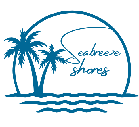
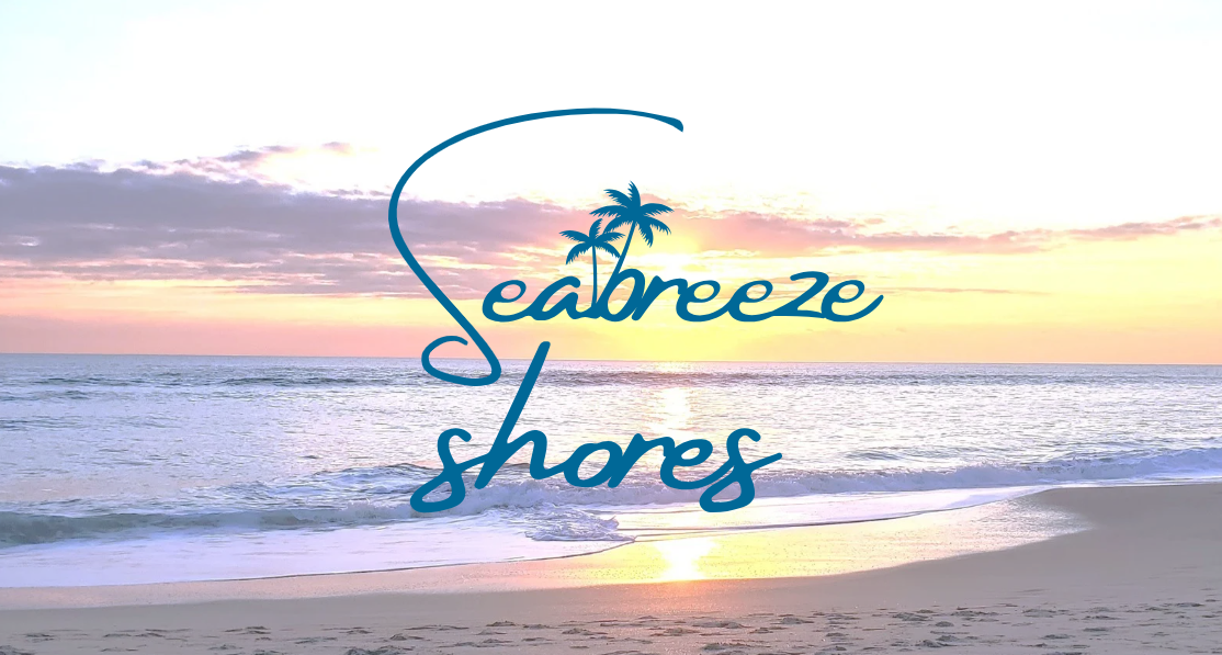
When creating the logo, I wanted to incorporate recognizable coastal elements that reflected the identity of the town. My original concept included larger palm trees, waves, and a setting sun paired with flowing typography inspired by the movement of the ocean.
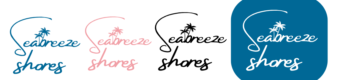
After evaluating the design, I simplified the logo while still maintaining the coastal atmosphere. The final logo kept the flowing script typography while integrating subtle palm tree elements into the lettering, creating a cleaner and more versatile identity that still felt connected to the shoreline.
Final Logo Variations
Original Photography
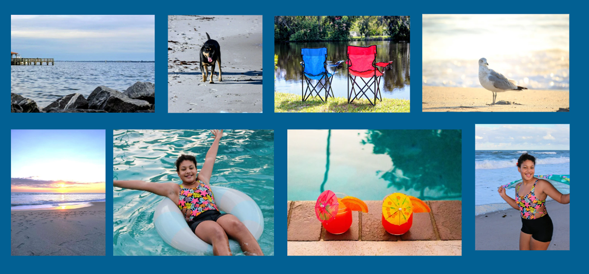
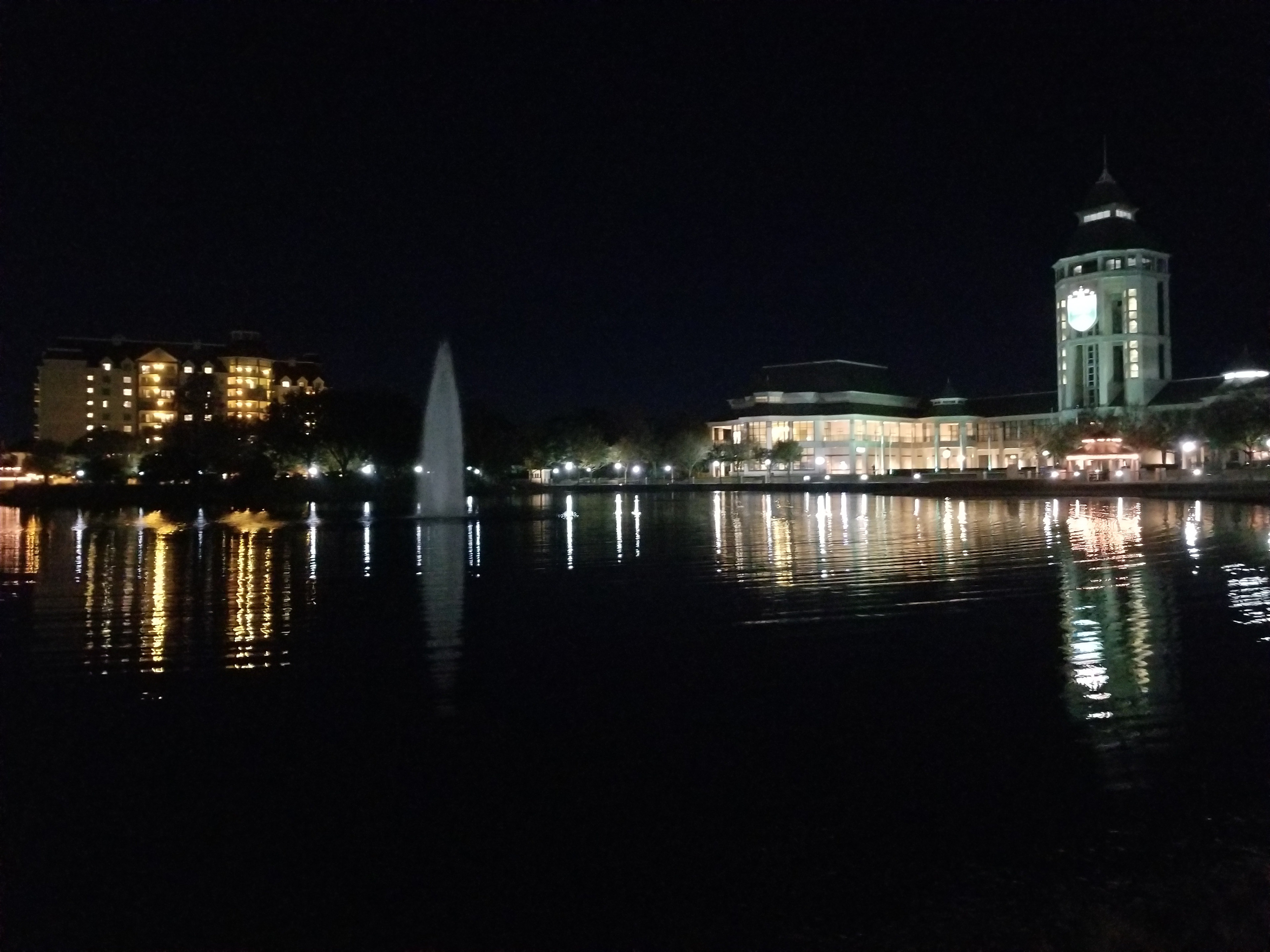
Photography played a major role in establishing the atmosphere of the campaign. All photography used throughout the project was personally planned and captured to reflect the peaceful and welcoming feeling of Florida coastal life.
The images focused on natural scenery, waterfront views, sunsets, recreation, and moments of relaxation to help create a genuine sense of place throughout the branding system.
Composite Imagery
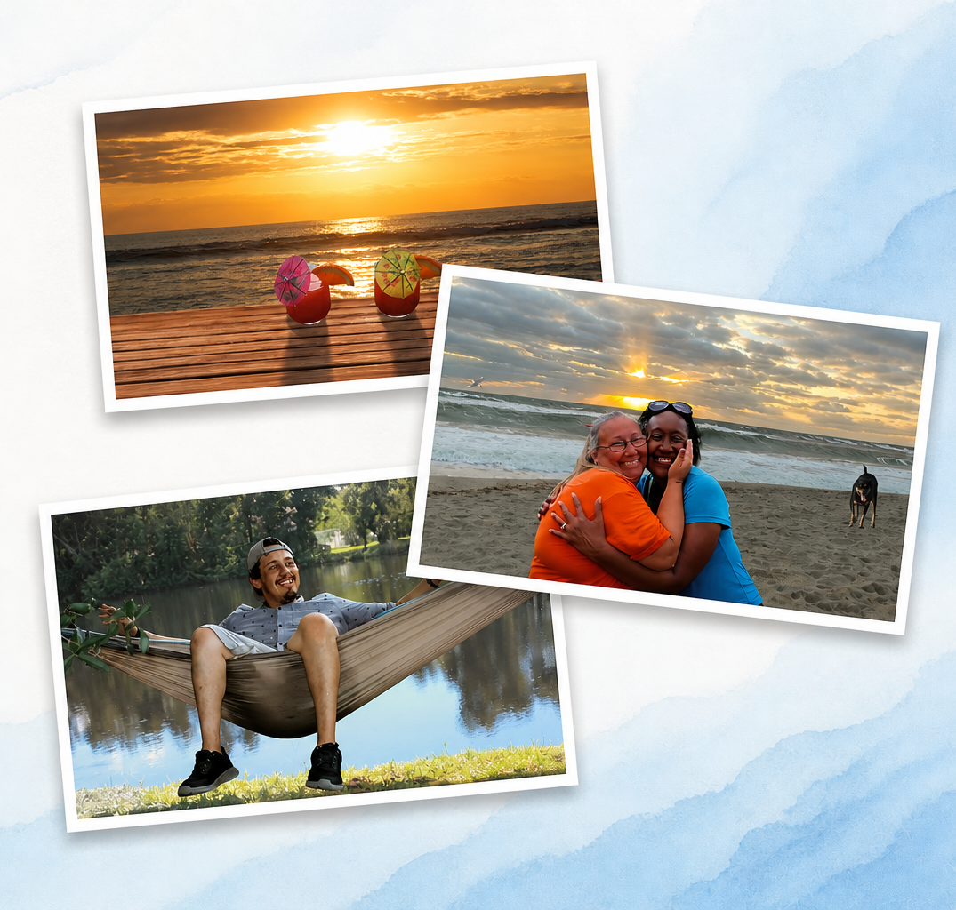
These image composites were created to highlight the lifestyle and emotional atmosphere of Seabreeze Shores. By combining layered photography and clean layouts, the compositions emphasize connection, relaxation, and everyday coastal living.
The goal was to create visuals that felt warm, natural, and inviting while maintaining consistency with the overall brand identity.
Brochure Design
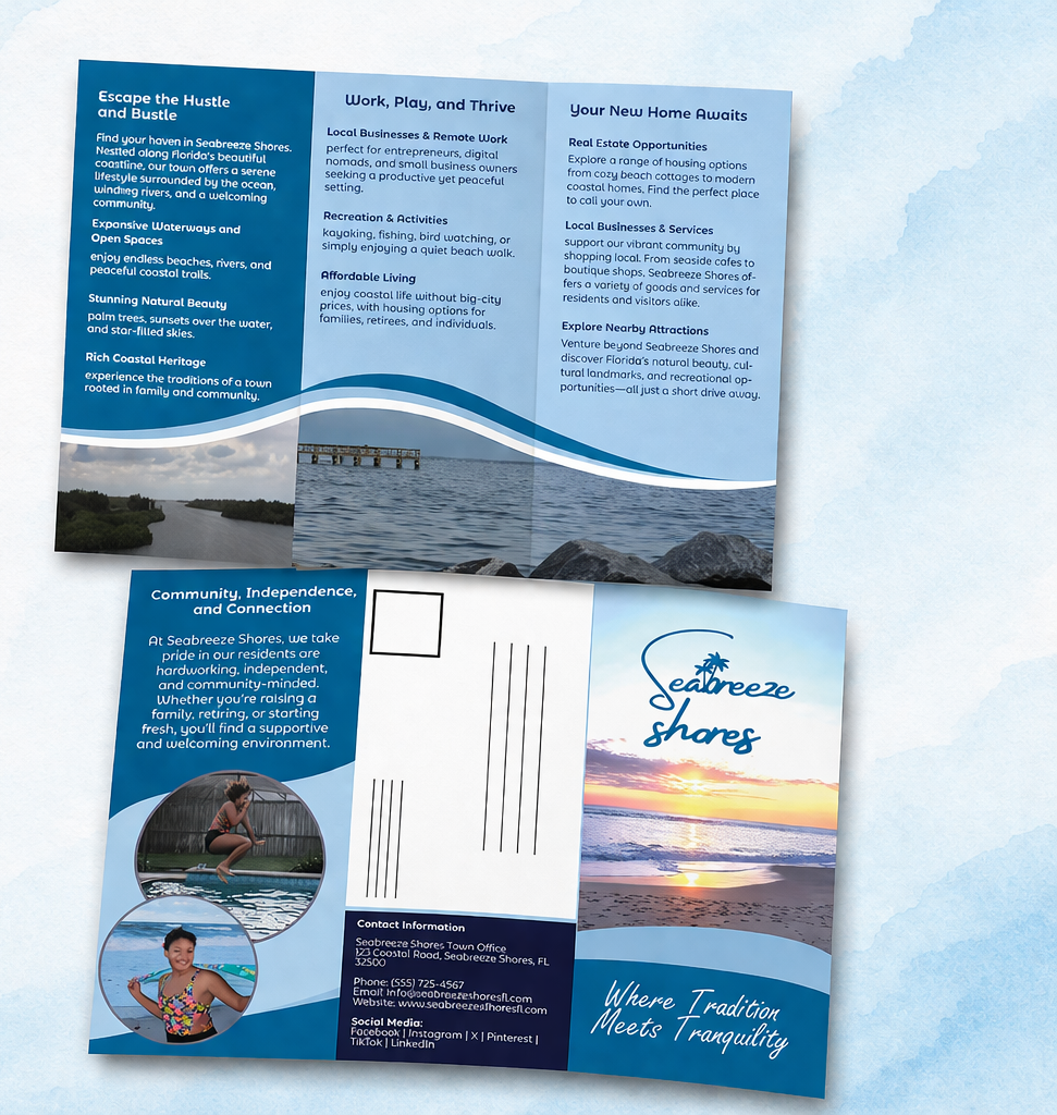
A self-mailing trifold brochure was designed to promote the Seabreeze Shores community through informative yet visually engaging layouts. The brochure highlights local amenities, recreation, housing opportunities, and the relaxed coastal atmosphere through a combination of typography, photography, and flowing wave-inspired design elements.
The clean layout and soft coastal palette were intentionally used to create a calm and approachable reading experience while reinforcing the overall visual identity of the campaign.
Brand Applications
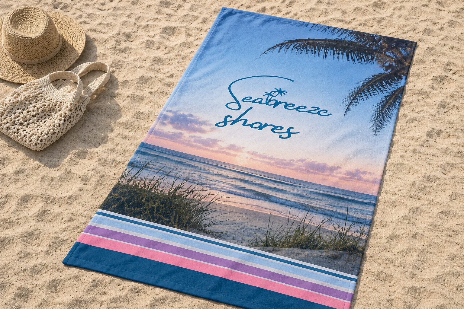
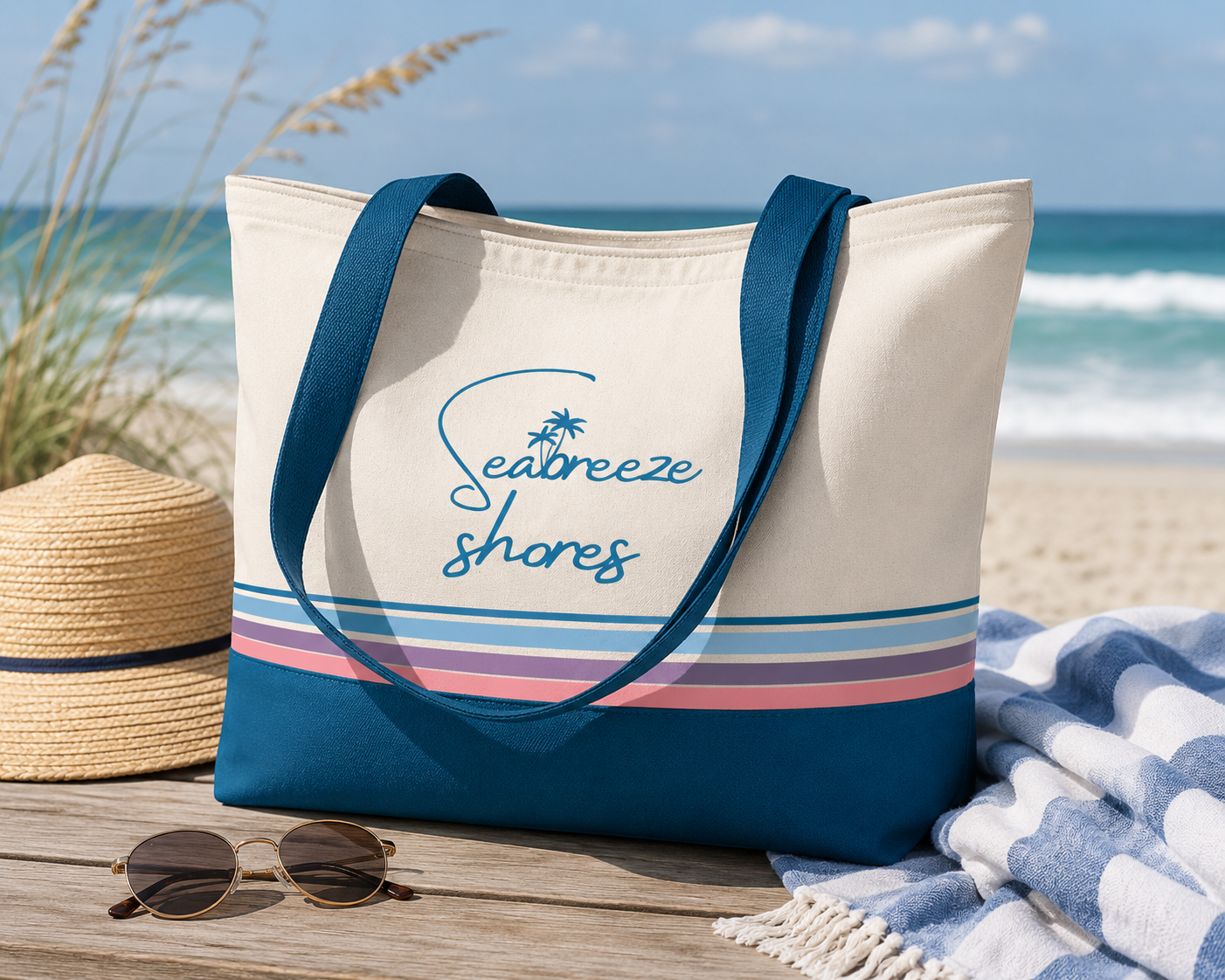
To extend the identity beyond print materials, additional branded applications were created to reinforce the relaxed coastal atmosphere of Seabreeze Shores. Items such as tote bags and beach towels help translate the visual identity into lifestyle-focused promotional pieces that feel connected to the everyday experience of coastal living.
That kind of ending feels very Behance-friendly because it finishes on visually strong mockups instead of ending on process work or text-heavy layouts.