Moo’s Ice Cream is a playful brand centered around fun, family-friendly experiences. This rebrand focused on creating a more cohesive visual identity that reflects the brand’s personality while improving consistency across packaging, stationery, and marketing materials.
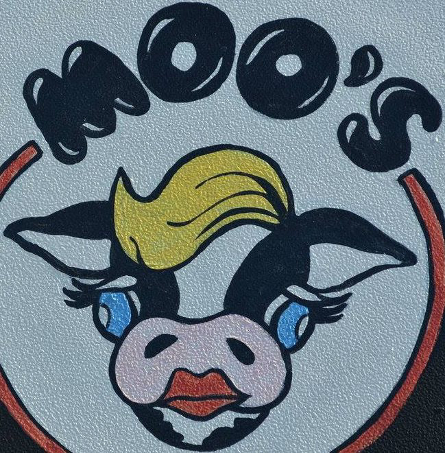
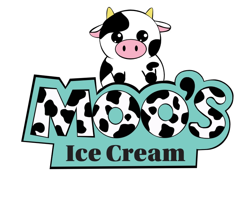
Original Logo
The original Moo’s Ice Cream logo featured a playful cow character and bold, hand-drawn lettering that reflected the shop’s fun roadside personality. While the design had a recognizable charm and strong local presence, the visual style felt dated and lacked consistency across signage and packaging. The rebrand aimed to keep the playful spirit while refining the design into a cleaner, more versatile identity.
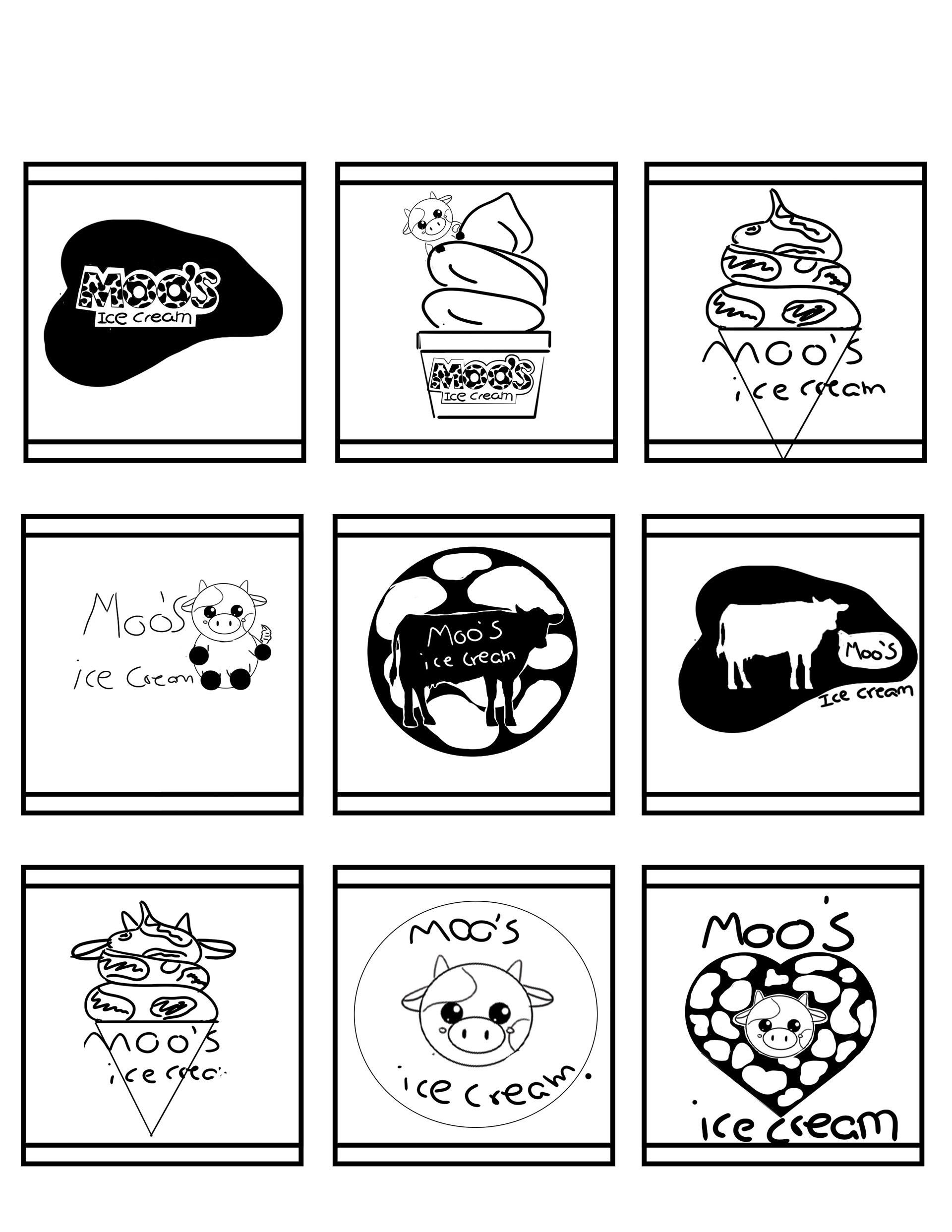
Concept Sketches
Early thumbnail sketches explored different ways to incorporate a cow character and playful typography. The goal was to create a mark that felt fun and approachable while remaining simple enough to work across different applications.
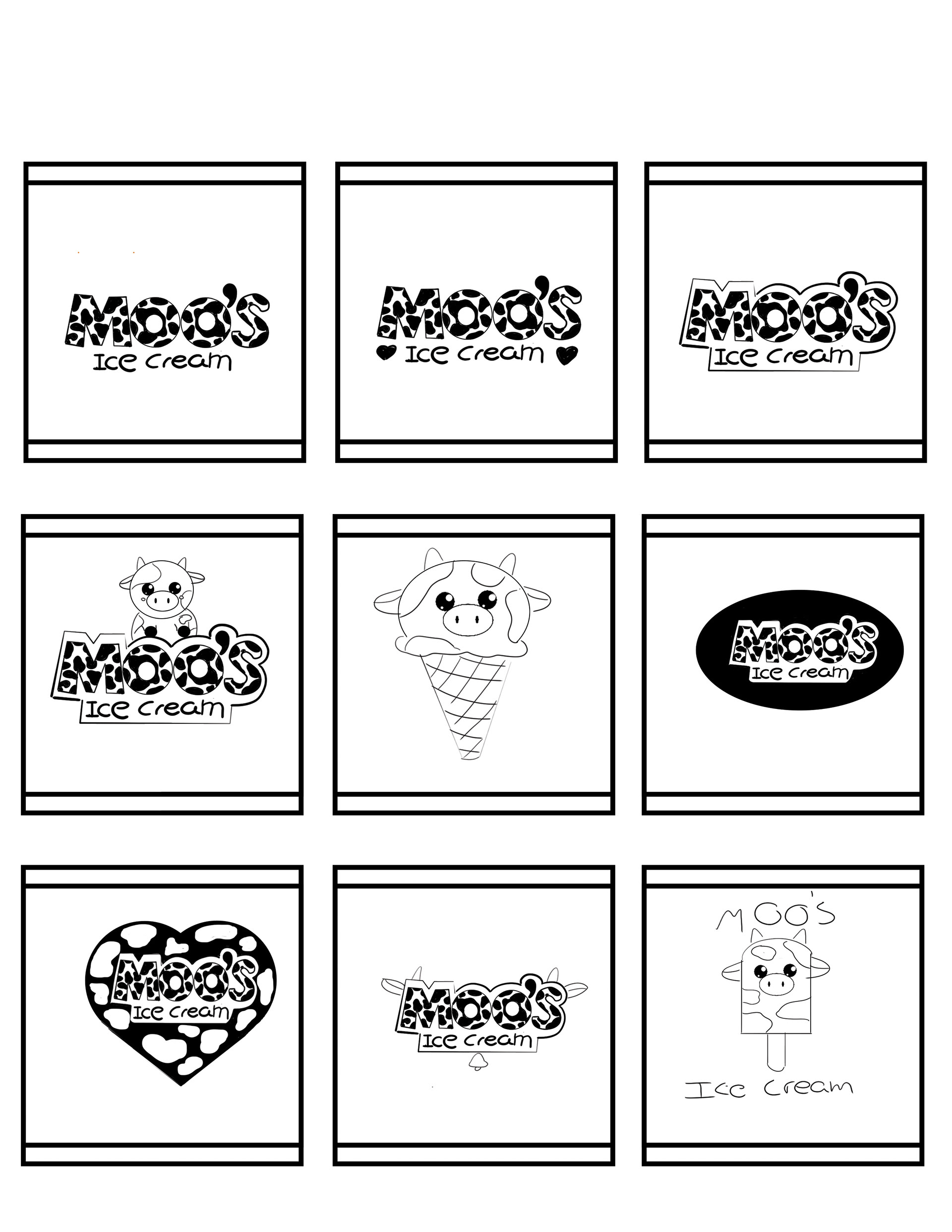
Logo Exploration
Early logo iterations explored different ways to combine the cow character with playful typography and cow-pattern textures. While these versions captured the fun personality of the brand, the designs felt visually busy and lacked the simplicity needed for strong readability. This stage helped identify which elements worked best before refining the final.
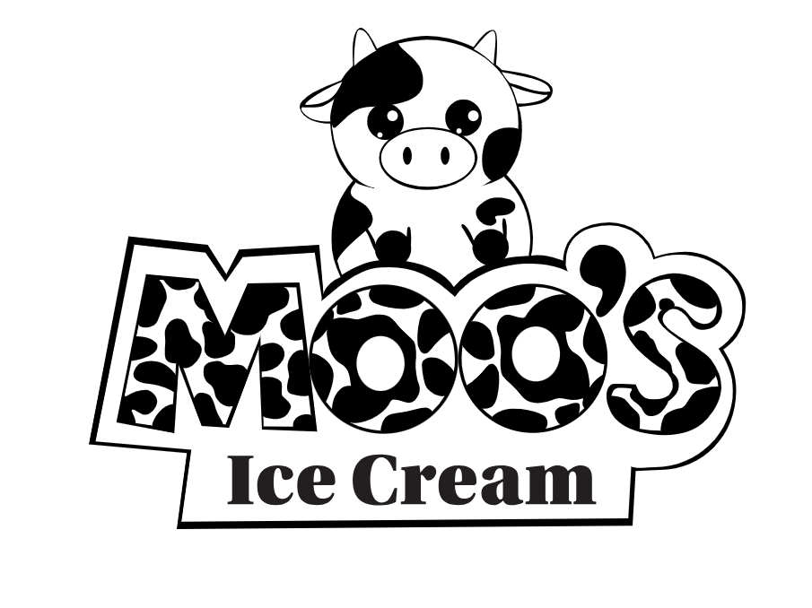
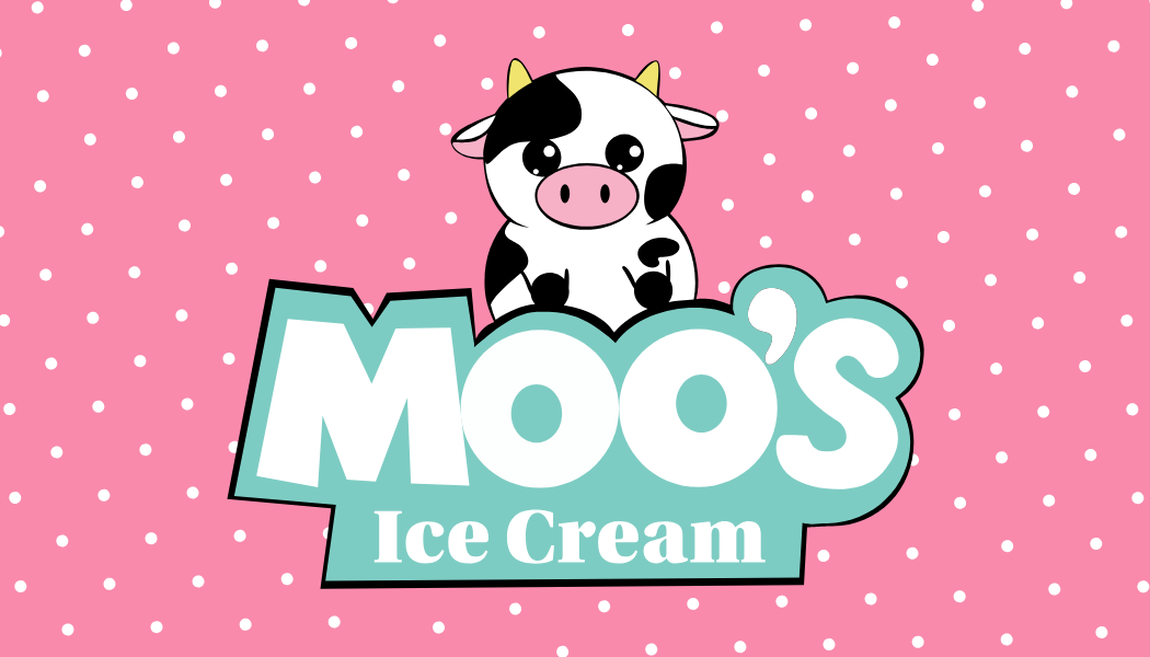
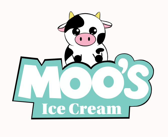
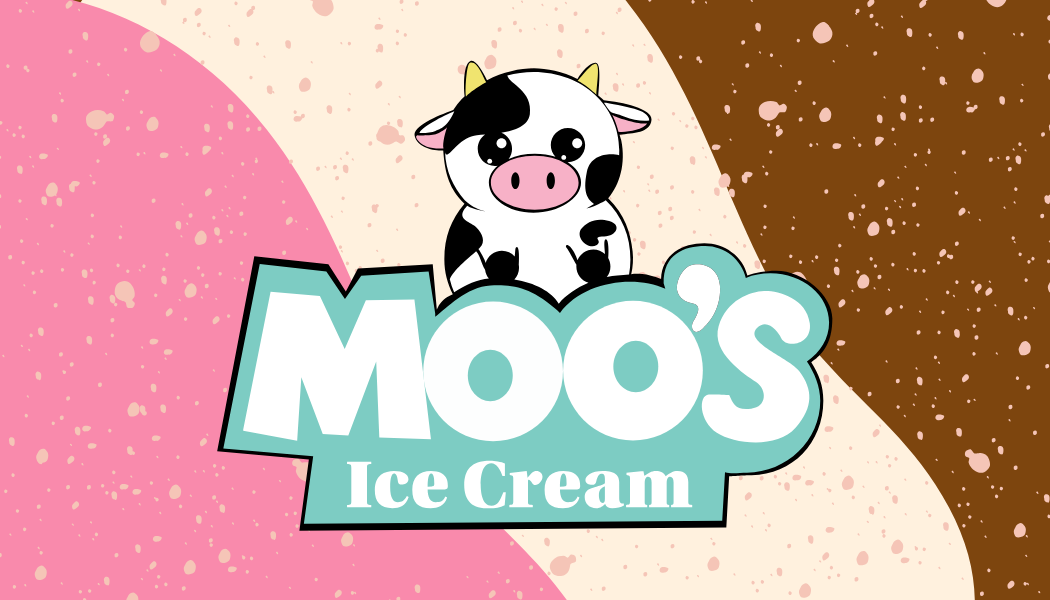
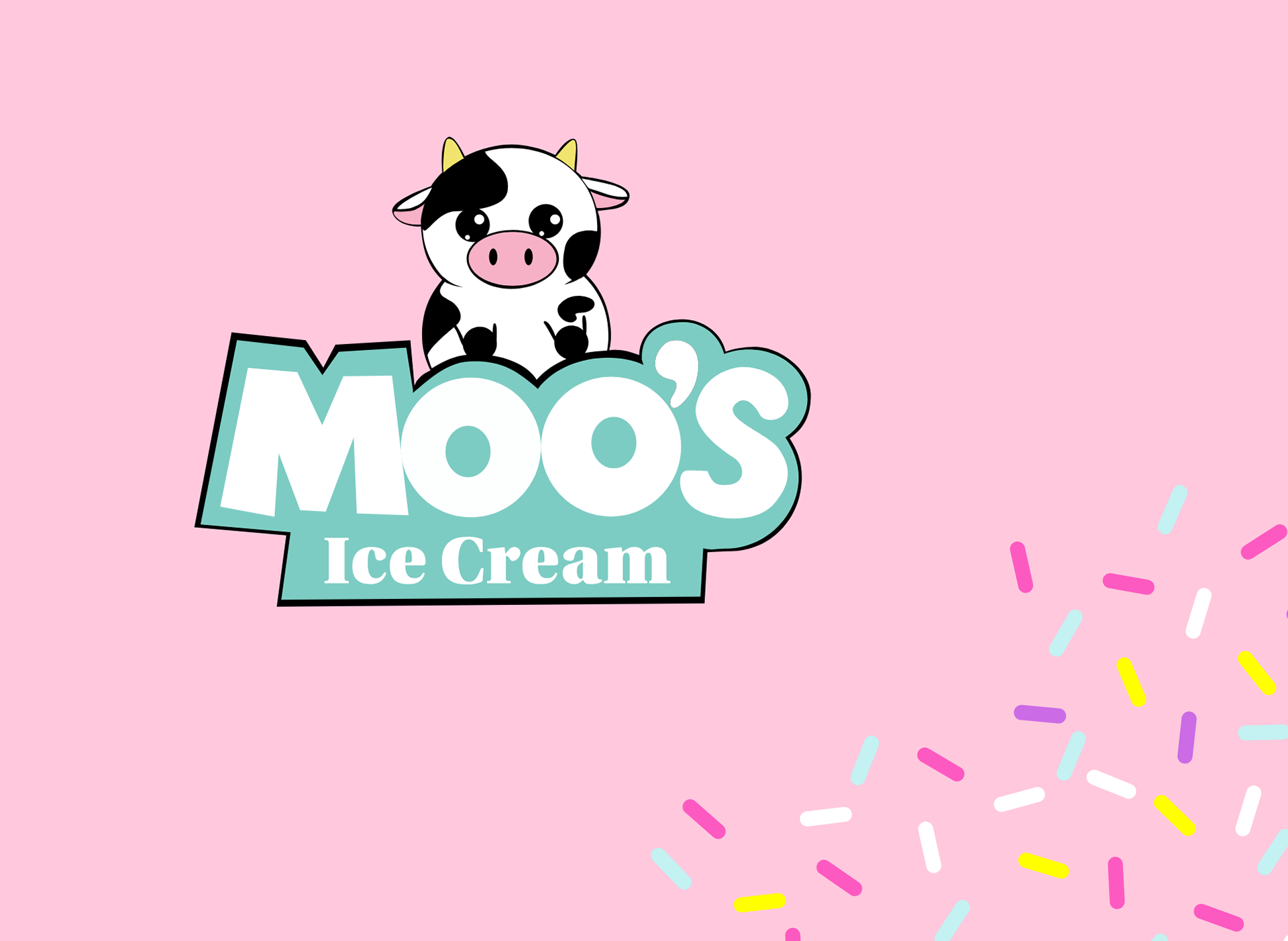
Final Logo
The final logo keeps the playful spirit of the brand while improving clarity and versatility. The character and typography work together to create a friendly, memorable identity that appeals to families and ice cream lovers of all ages. The simplified design allows the logo to translate easily across packaging, signage, and marketing materials.
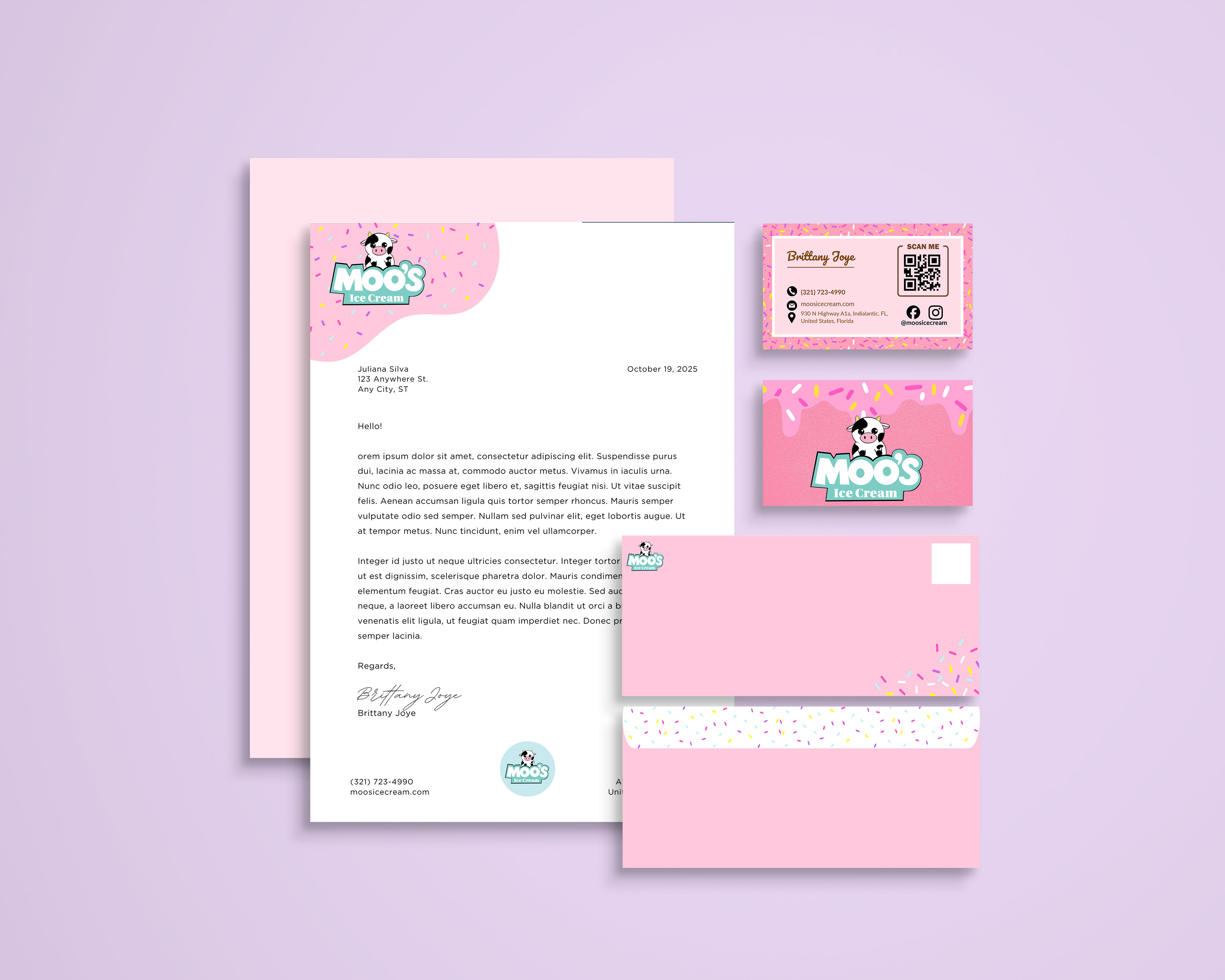
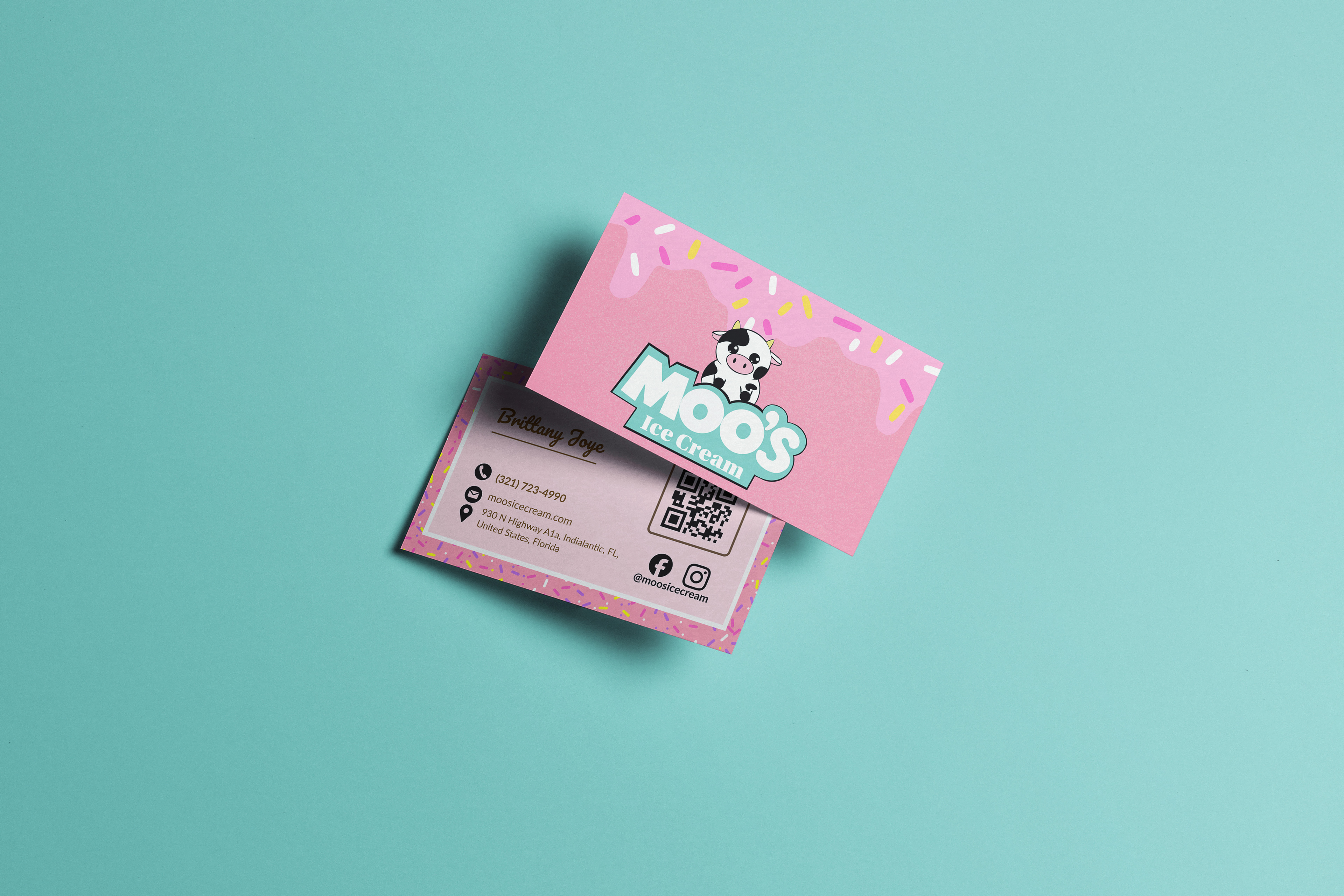
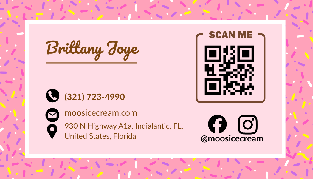
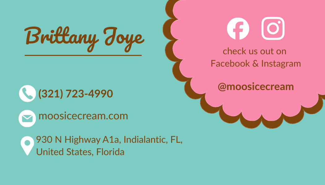
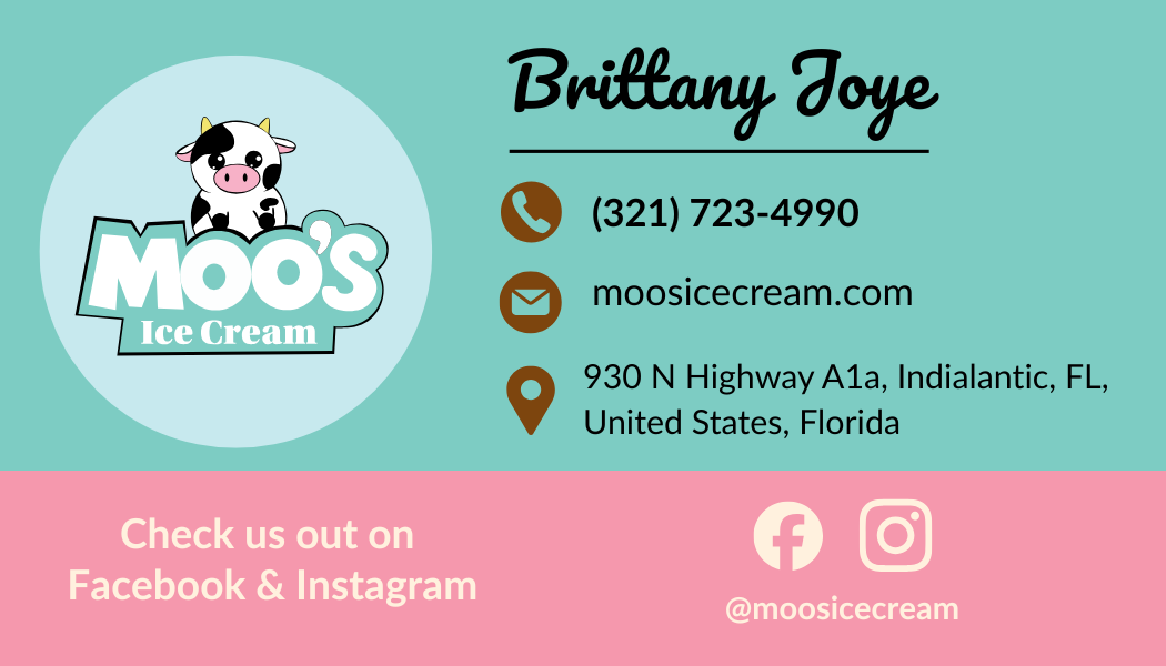
Business Cards
Multiple business card layouts were developed to explore how the brand identity could translate into printed materials. Each version highlights the playful tone of the brand while maintaining clear and readable contact information.

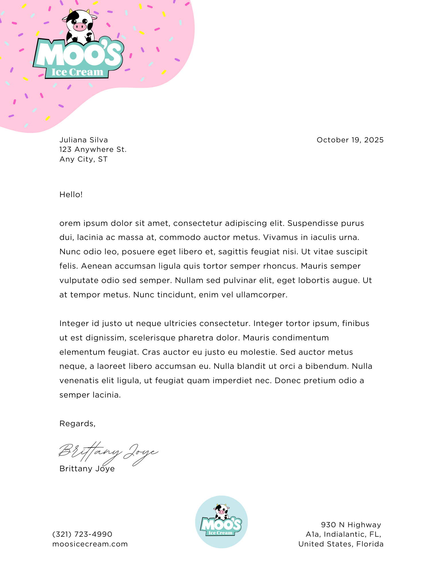
Stationery Set
A cohesive stationery system was created to reinforce the new brand identity. The designs use the same colors, typography, and character elements to maintain consistency across everyday business communications.
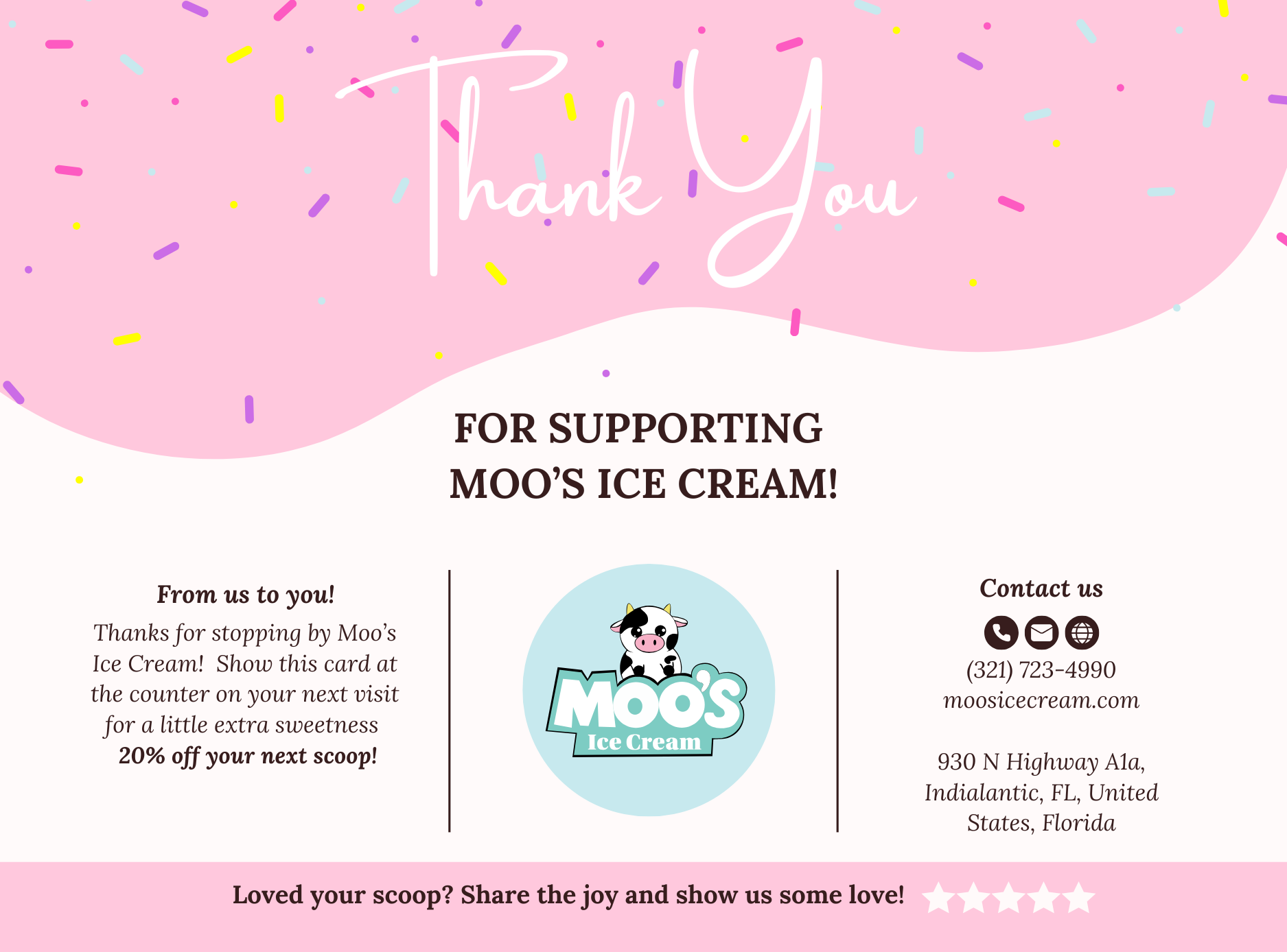


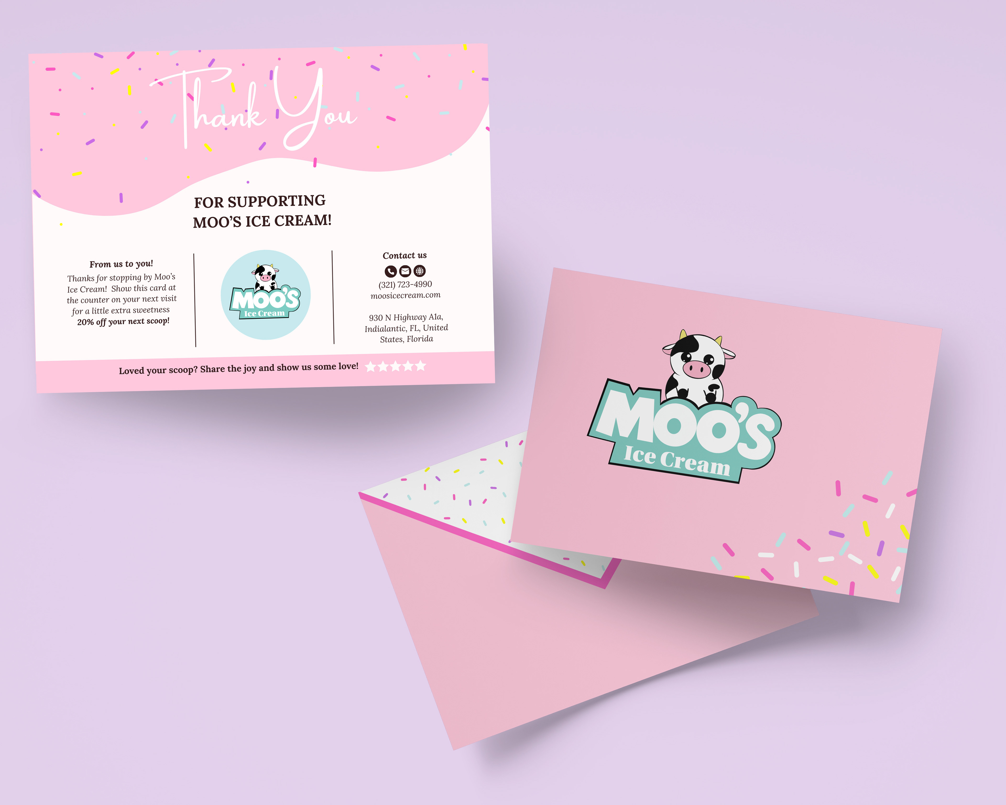
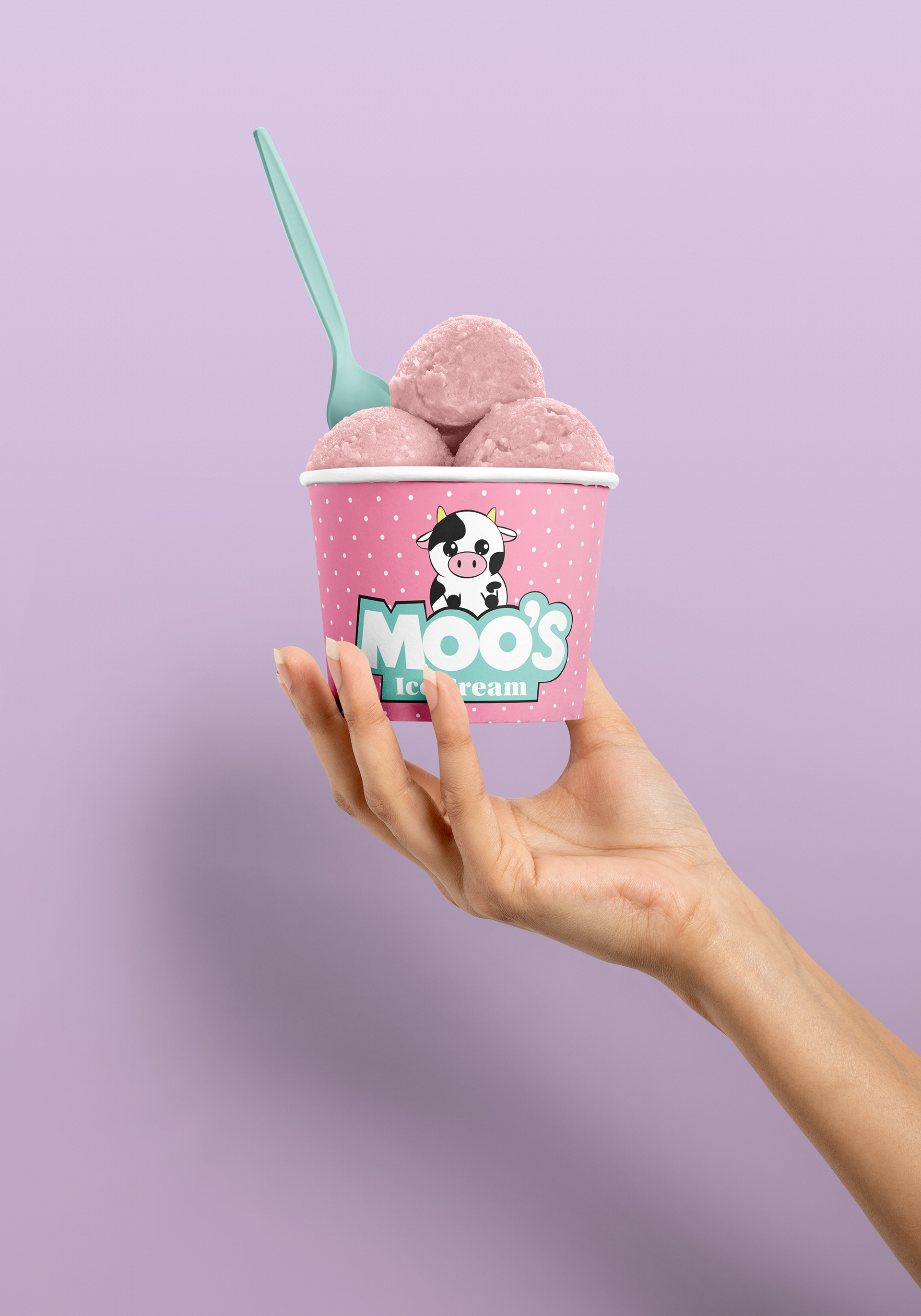
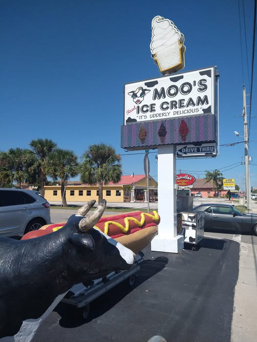
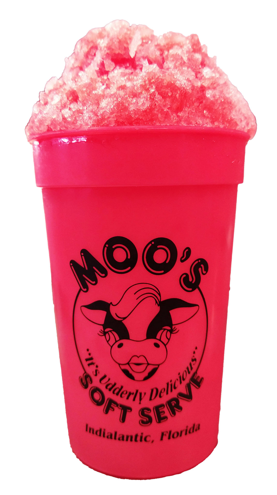
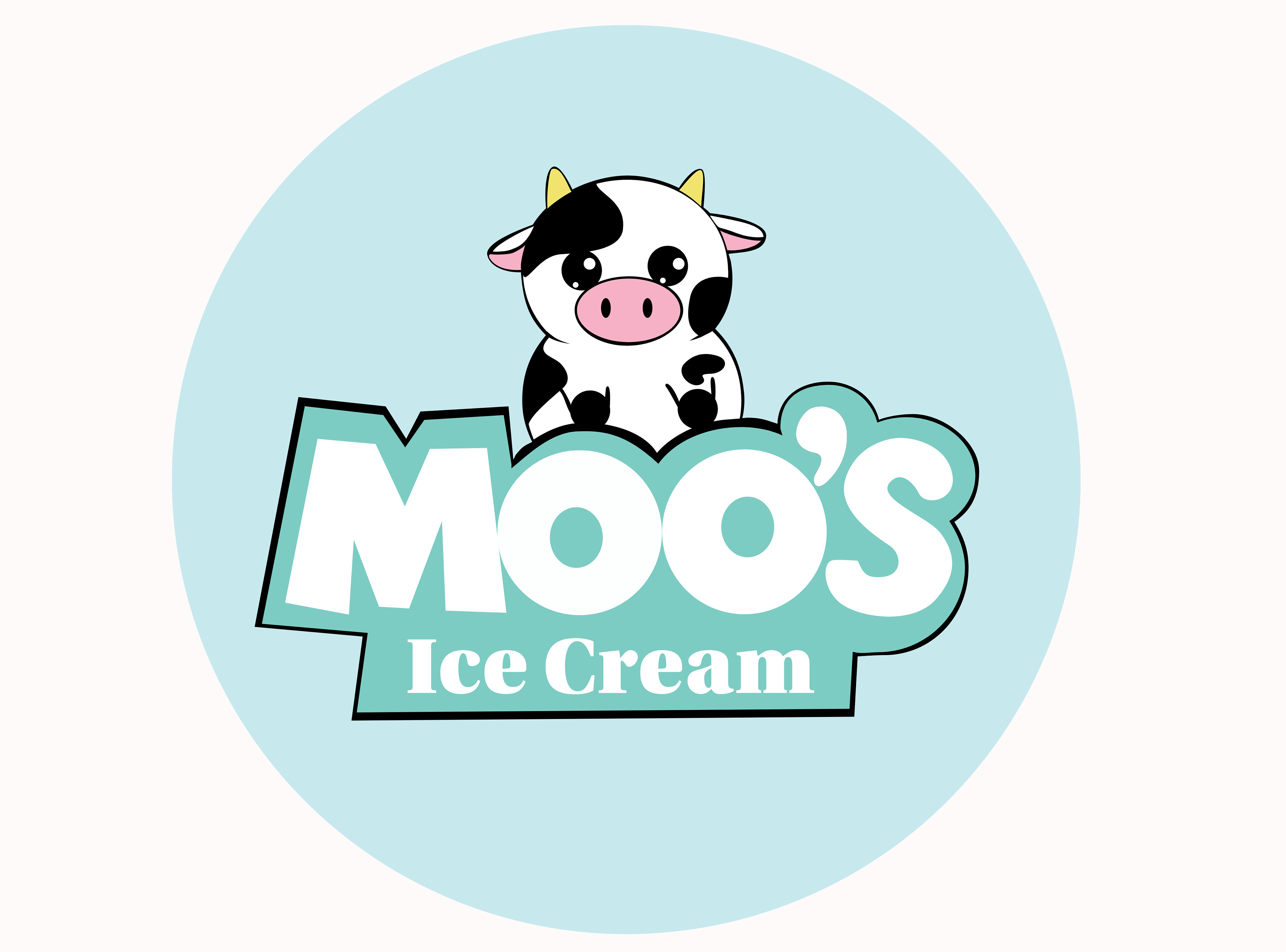
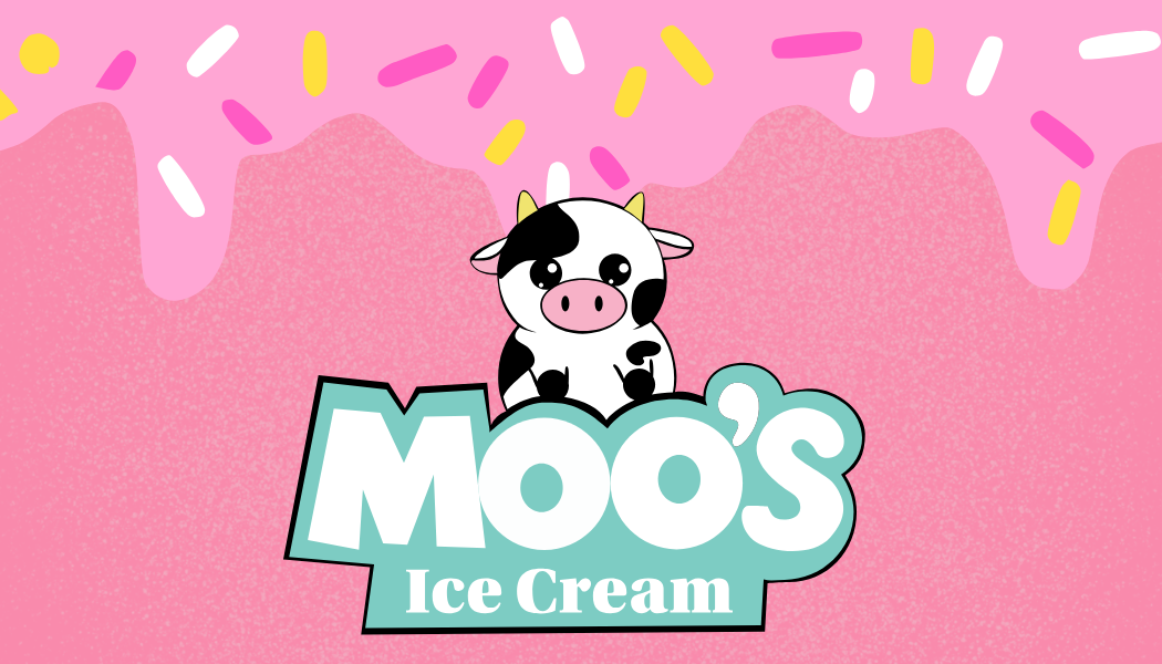
Brand Applications
The rebrand extends beyond the logo into a full set of marketing and packaging materials. From ice cream cups to thank-you cards, each piece reinforces the playful personality of the brand while creating a consistent and recognizable visual experience for customers.
Final Brand System
Together, these elements create a cohesive and flexible brand system that captures the fun and personality of Moo’s Ice Cream while supporting real-world marketing and packaging needs.